The 10 mistakes I see everyone make in their Virtual Reality user interfaces
THE 10 MISTAKES I SEE EVERYONE MAKE IN THEIR VIRTUAL REALITY USER INTERFACES
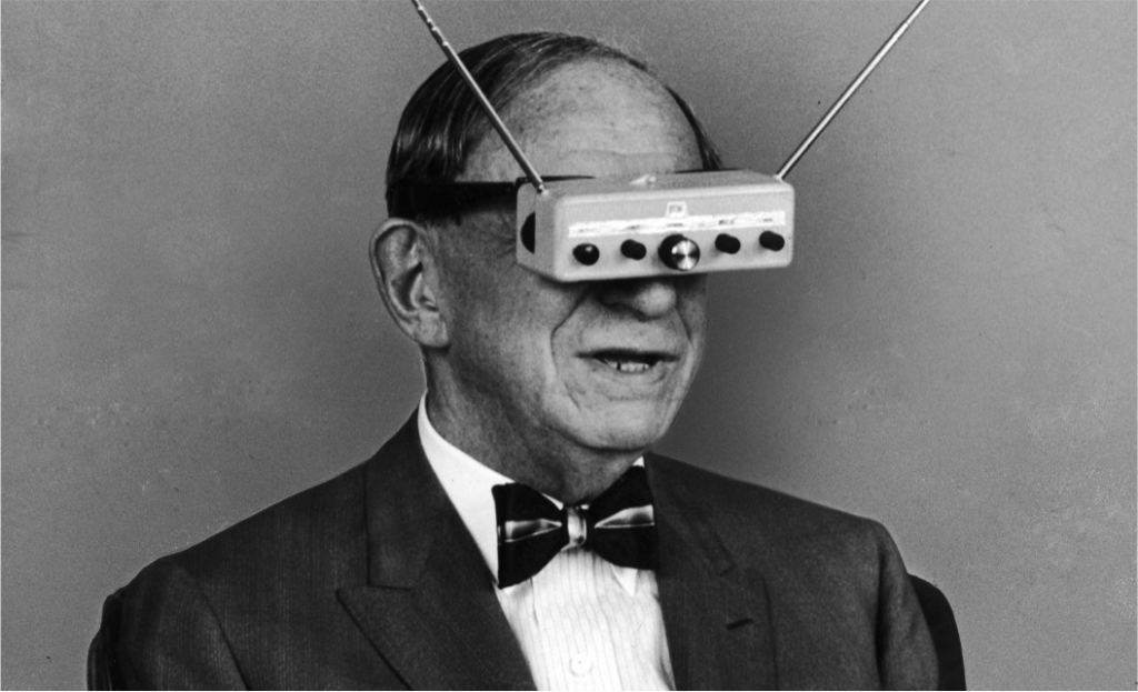
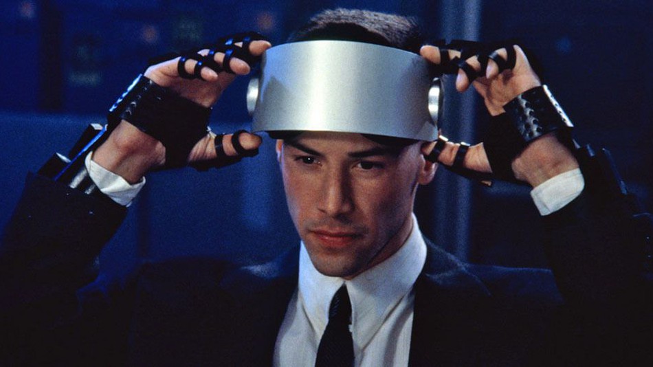
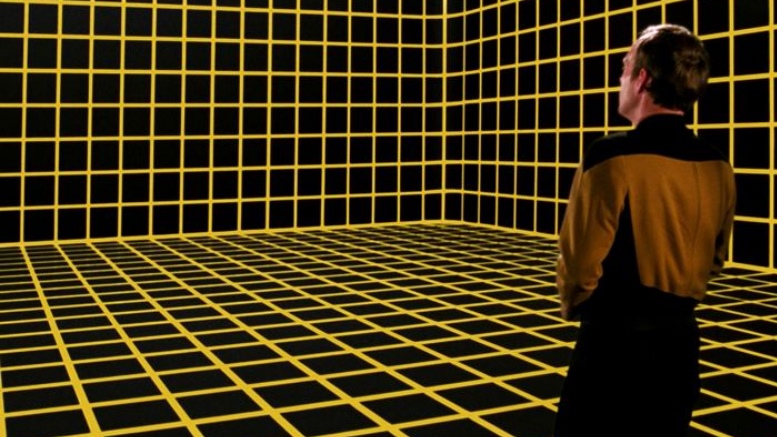
Cover art: this perpetually-awed gentleman on the Oculus Rift official marketing
The 10 mistakes I see everyone make in their Virtual Reality user interfaces
Introduction – On Puppies & Wolves
Virtual Reality in the year 2020 has a nasty Catch-22.
Big name companies are squeamish to invest in a tech that has such a low return (VR users on Steam just crested over 1.3%). Meanwhile, Indie Developers, those workhorses of the VR Industry, lack the resources to make vast, richly satisfying games. Player expectations are lowered, which then lowers returns, which then justifies AAA companies in saying, “See? Let’s stay away even harder now!” — which lowers audience expectations, which lower resources for Indie’s and so on and so forth…
All of this culminates in a whirlpool of some earnest – but admittedly amateurish efforts in the current lineup of VR experiences.
But grimacing, fist-clenching Indie VR developers need not despair! As a UI / UX Designer of over 15 years and a religious virtual reality user – I think I have a reasonable handle on how to fix one of the rougher edges: user interfaces in Virtual Reality. I’ve tried to make this list as actionable as possible; a sort of “break in case of emergency” kit for Indie VR developers of all walks of life and skill levels.
Disclaimer: I want to keep things very light and positive around here – so you will never (rarely?) see me harp or criticize another Developer’s work. And for the purposes of this list, you will not see me point to the most egregious offenders by name. Mostly because I wouldn’t want them to do that to me, and I’ve made some real clunkers in the past (getting better though!).
So clean your lenses and wait patiently for a hardware restock: here are the 10 biggest mistakes I see VR developers make when they design virtual reality User Interfaces and User Experiences
10.) They Hide the Root Menu at the Start
9.) They Make Navigation a Scavenger Hunt
8.) They’re Crazy Bad at Typography
7.) They won’t let me rest my weary bones
5.) They don’t use our natural senses
4.) They don’t protect us from ourselves
3.) Forgetting to turn their hands over
2.) Thinking VR is an off-the-rack suit

The 10 mistakes I see everyone make in their Virtual Reality user interfaces
10.) Hiding the Root Menu at the start
When designing a console game’s interface, there are a set of standards and practices the designer must adhere to (TRC or TCR depending on which mega-corp you’re dealing with). While only mildly limiting in creativity, these standards create confidence in end-user navigation and clarity in production.
By comparison, it’s soccer-hooligan anarchy in Virtual Reality. Some main menus are hidden behind an object the User needs to touch (Hellsplit: Arena, Superhot VR), others chameleon-cloak it somewhere on their person (Pavlov VR, Pokerstars VR), or put them before a panoply of options (Hot-dogs Horseshoes and Hand Grenades, Blade & Sorcery).
Let’s make our own Virtual Reality TRC/TCR’s real quick, just to plant a flag somewhere.
Have the Main Menu ready as soon as the game starts. Devs can load in a floating limbo to save resources and load time, or you can bring the audience into a persistent space. Just be sure their root level options are available to them immediately. Don’t make them run around the space to find their options either (but do consider a fun space to explore!). No reaching either – attach a laser pointer to their index finger.
At an absolute minimum as soon as the game starts: show ‘em the name & give ‘em the goods.

The 10 mistakes I see everyone make in their Virtual Reality user interfaces
9.) Making navigation a scavenger hunt
O-oh… so the poster is the settings menu. Okay. Oh wait the doorway was the Exit-to-Desktop? Um, sure I guess that makes s- You’re kidding me, this thing on my wrist is the mic button? GET THE F- I tap the side of my head to EMOTE?!?!
When I’m on the job or mentoring, a game I like to play with clients/students while looking at a screen is: “Where am I supposed to be looking?” On flat-games, this is a reductive (but oh-so effective) test of how navigable an interface is to the end-user. Can I find buttons? Are lesser options dialed down? Is the first time user experience overwhelming?
In VR, my game of “Where am I supposed to be looking?” it’s a matter of Cheshire abstraction.
Why not put the whimsy in the game and not in navigating its options? Keep buttons simple: perhaps one consistent, hot, single-use color. A particular shape or treatment (glows, blinks). Icons that are only used for tappable / selectable items as you near them. Create a visual language dedicated to helping players and commit to its consistency and aid.
No, I am not curtailing creativity, or stymieing the inherent ecstasy of exploring in VR. This is an earnest request to remember the audience has been inset into a breathtaking new time and space. Lots of things you are taking for granted they are taking in for the first few seconds – and those first few seconds color their perception of your entire game – including its refundability!
Make navigation crystal clear. The audience wants to live in new worlds, make it easier for them to jump in.
The 10 mistakes I see everyone make in their Virtual Reality user interfaces
8.) Being crazy bad at typography
Holy Hell, let’s talk about everybody’s bowel-loosening usage of type.
Typography is a delicate, sensual talent that takes decades to excel at/in. Indie barely has the time to eat. Thusly wracked with pity and sympathetic hunger pangs, I have made this this entry a bullet-point list of incredibly actionable items:
- No Serif fonts, Sans Serif only. Serifs are the “fiddley-bits” at the end of letters, and Serif’s tend to be thinner characters on the whole. These Serif fonts read very badly on fuzzy 1st and even 2nd generation screens and you absolutely must work around the idea that not all eyeballs are created equal.
–
- Leave some padding around where you place text. Violating this rule contributes the most to bad typography.
–
- In general, come to the table with two fonts (or for the budget-conscious, two weights): a body font and a title font. Title fonts can be fancy and stylized; they will be mostly read at large sizes. The body font should be boring-as-hell and legible at comfortably small sizes and in paragraphs.
- Try to be conservative with your title font. If you found a font and exclaimed, “That looks so cool!”, it’s probably too much and you need to dial it down!
–
- Left justify. It’s the WWJD of typography.
–
- Right justifying will get you expelled in certain Art Schools.
The 10 mistakes I see everyone make in their Virtual Reality user interfaces
7.) Not letting people rest their weary bones
VR is at its most thrilling when kinesiology and technology helix together. The thrill of bodily expression (and not canned animation!) or persisting in a world the nervous system utterly believes is incredible. People aren’t just interacting – they’re acting, and all the world is their stage.
And baby, encores are hard.
I work at a standing desk, so my lower extremities have a Robocop-like physique. But many early VR adopters realized they were comically out of shape as lactic acid boiled them alive as they stood for less than twenty minutes at a pop. Then there’s the neck strain from heavy headsets, fatigue from holding twin controllers aloft, eye-strain from poor calibration…
Make it easy on the bodies locked in corporeal meat-space. Let them suction up items from the ground without bending over – and please don’t feel this has to be justified in-game, it’s far too important a feature to omit. Include a crouch button so people don’t have to bend the knee to erstwhile Khalissis. Have an option to toggle gripping objects instead of constantly having to squeeze.
In VR, two controllers are the standard, but let’s be honest, there is a third. This Third Controller is delicate, out-of-shape, wheezy… and the most precious element of the entire mechanism.
The 10 mistakes I see everyone make in their Virtual Reality user interfaces
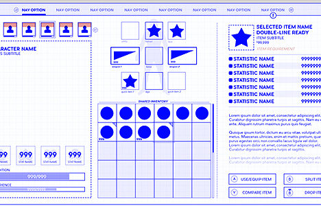
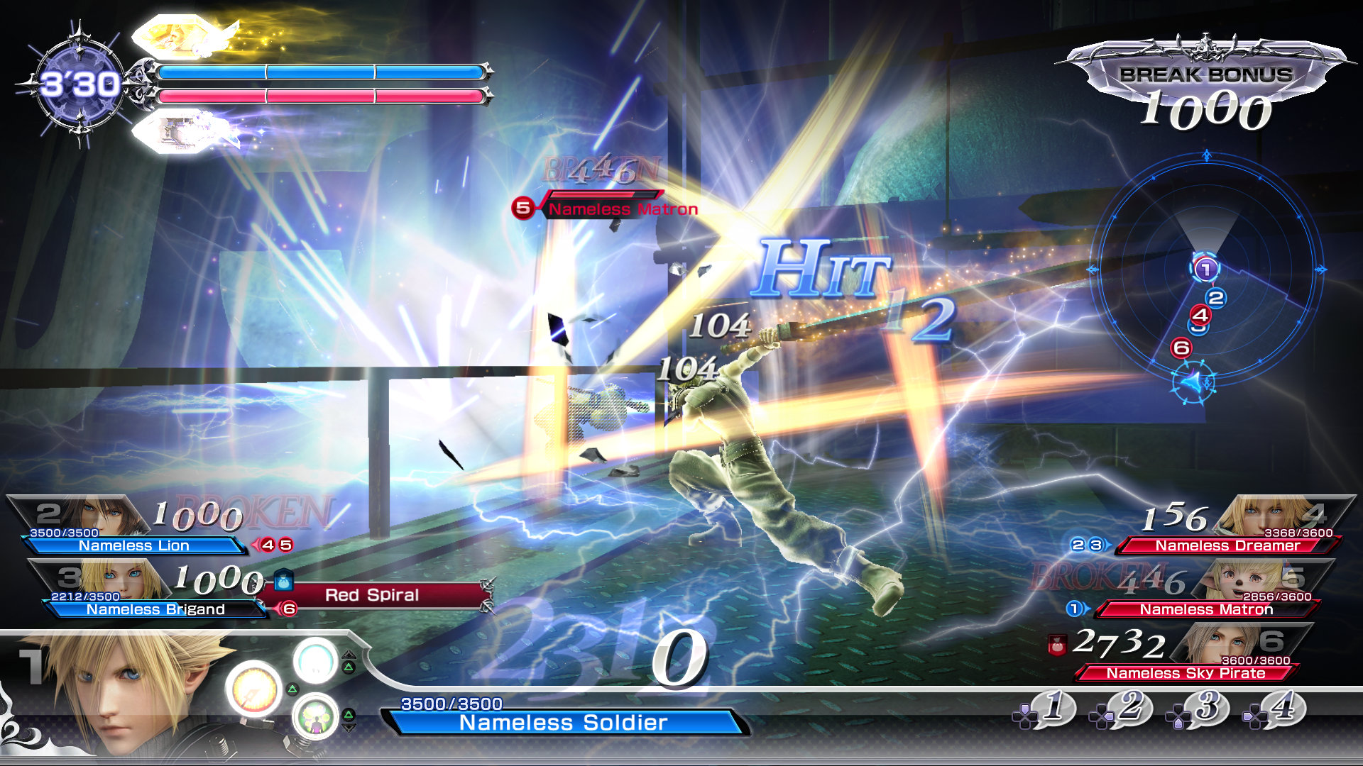
6.) Making pancake-HUDs
When I worked on Rage for id Software, the background story for the interface was that the player had nano machines in their body. These intelligent computers would weave through the bloodstream into the eyeballs, forming the HUD inside the pupils. It was an interesting conceit we teased into the animation and design.
I think about those dang nanites every time a VR HUD throws cataracts of information over my pupils, giving me User Interface floaters.
The conceit worked in Rage because we had story justification. Barring some kind of physical justification for a HUD on screen, like a helmet (Espire 1: VR Operative, Echo VR, V-Racer Hoverbike) there is no earthly reason to have a floating HUD in virtual reality other than we couldn’t think of anything better.
To which Devs will surely bemoan, “Yeah but, John, we’ve got information we need to convey to the player!”
I get it, I hear you — But do you? Do you really need to convey to the player that an item has been stowed or can they just hear a zipper and feel a haptic? Must they see their health bar when it’s above 50%? Can all that information live on flat conceit like a clipboard, a watch, or a phone? Are there other ways to feel information other than to display it?
Every once in a blue moon, somebody can break the rule and make a beautiful flat-game UI in Virtual Reality (Racket NX, Until You Fall). But those are exquisite exceptions. In VR, leave the pancake interface behind. When replicating the real world, why not make use of the natural queues that exist in the real world? Hey — speaking of which–

The 10 mistakes I see everyone make in their Virtual Reality user interfaces
5.) Not using our natural senses
I’m going to tell you a trade secret every User Experience designer has known since the dawn of design: the average person isn’t just stupid, they’re damn stupid. Unobservant, poor readers, terrible listeners – professionally we have to work around the lowest common denominator of eyes and brains as a rule.
People don’t get cleverer in Virtual Reality per se… just a bit more in-the-moment. In the simulated world, the limbic system (responsible for our freeze, flight and fight responses in that order) is on high-alert and the observable world becomes much more… well, observable. That means we can subvert our expectations about the average intelligence of our Users.
A little.
Use audio queues and sensory feedback as a first draft, not a last resort. In Hellblade: Senua’s Sacrifice, attacks from off-screen are telegraphed with binaural audio (voices in your head telling you to watch out!), pointed in the direction of the strike. Hotdogs Horsehoes and Handgrenades gives you the lightest buzz when your hand sweeps over a spot on your body to retrieve or stow an item. Boneworks stylizes the screen as you take damage, with the critical state being your character screaming in no uncertain terms, “Ahhh, I’m dying!”
Sure, the average gamer is observably dim (why are you booing me, I’m right!), but the VR crowd are at the very least attuned to their senses; sensitive to a suite subtle cues developers traditionally overlook. After all – as far as the Player’s reptilian brain is concerned, it’s their ass on the line. You can go for the light touch.
The 10 mistakes I see everyone make in their Virtual Reality user interfaces
4.) Not protecting us from ourselves
VR is charmingly ruinous like the first run of the Nintendo Wii. Monitors crack, controllers soar and pets need round-the-clock therapies – and it makes sense. We didn’t spend all this money to not get into it. We want to be deeply, authentically there and reactive. And sometimes, based on the experience, we may react at an 9 when we thought we were at a demure 2. 3 tops.
That’s why it’s important to protect the player in the very real, very bruise-and-cost-heavy reality they persist in. An indicator that shows the Player is facing the wrong direction is a wonderful quality of life improvement. Crouch buttons alleviate physical stress from performing the labor yourself. You’d be amazed how many people forget to put on hand-straps without a stern chiding in the main menu. A damn pause button(!), the list goes on.
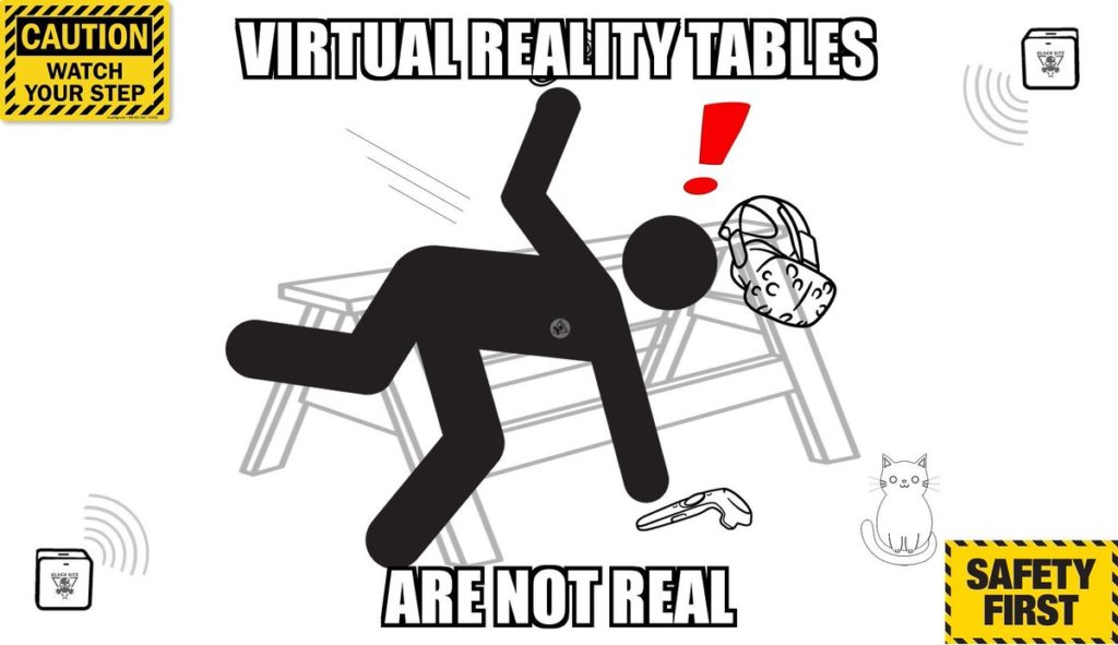
Your users are puppy-dog vulnerable while they’re pretending to be wolves. Dote on them in both worlds.
The 10 mistakes I see everyone make in their Virtual Reality user interfaces
3.) Forgetting to turn their hands over
Games, as a genre of entertainment, tend to have any number of resources to keep track of. Monopoly money, Bishop pieces, Dungeons and Dragons McGuffins. No matter how organic you may want the experience to be, they still need to know a few quantities off-hand.
And, for whatever reason, developers forget I can turn my hands over. Or turn my wrists… Pull my arm out in front of me like it’s a watch… Glance up at a 60 degree angle…
In short, many VR developers forget your natural body has lots of places to hide unnatural HUD widgets. Numbers and letters are obtrusive, absolutely, but on an inverted palm, or the inside of my elbow, or looking down with my neck to my chin? Can you turn specific parts of my body into what would be traditionally considered a UI widget?
Make activating the widget take a concerted effort, but make it a physical one. People are very forgiving of out-of-context cues so long as they’re effective. That information must be shown does not necessarily mean it must be shown garishly or awkwardly.

The 10 mistakes I see everyone make in their Virtual Reality user interfaces
2.) Thinking VR is an off-the-rack suit
In addition to the usual polymath difficulties, traditional User Interface design has to take into account the very bespoke needs of some very bespoke individuals. Color-blindness, inverted controls, accessibility options, and don’t even get me started on where you put the subtitle option…
These detailed considerations telescope into the Nth dimension for Virtual Reality experiences. Blinders, Teleporter options, height calibration, floor-offsets, eye distances, controller angles – You’re the barista at a Starbucks and every order is infuriating.
And absolutely, these needs must be catered to, inclusive of their annoyance and itinerant feature-creep. This is the nature of VR, and I don’t see it changing regardless of fidelity of install-base. Humans vary wildly, and this time, the Human is the controller. That requires a new kind of production pipeline and a whole new breed of patience.
Factor this in, budget it and bear down. The Audience probably won’t appreciate the extra production involved in all this tailoring, but by that same token, they probably won’t refund the game, either.

The 10 mistakes I see everyone make in their Virtual Reality user interfaces
1.) Forgetting the Fourth Wall
You know what’s great about the Holodeck on Star Trek? They always showed that the Holodeck was as real as they needed it to be. They’d save sessions mid-program all the time, call in the Arch, get calls in the middle of a game – Star Trek presented virtual worlds as very clearly being a second priority.
That’s a lesson for everyone still living and developing games in the 21st century. No matter how earnestly or bravely you are crafting worlds, I still need to turn off the mic. I need to push the Valve menu button and not see another menu. I still need to get my bearings much longer than on a flat-game. And I still definitely need to pause the game and pee!
On a frustratingly related note, yes, there are VR games that won’t let you pause the game.
The Fourth Wall is perhaps the penultimate problem with VR experiences – at least by way of interfaces – and really the intersection of problems 1 through 9. We’re all new, the tech is new, the developers are new, and all the genres have had bold new remixes. The old ways cannot persist in this brave new world.
That means brave new ways of thinking. Across. The. Board. And while we are in the neonatal stage of this exhilarating new tech – we should temper our expectations and designs accordingly. Incredible things are on the horizon.
Let’s make sure everybody knows the way.
John “The Wingless” Burnett is a 15 year User Interface Artist (UI Artist) and User Experience Designer (UX Designer) in the video game industry and digital design sphere. He is an award-winning artist available for hire or for UX Design Mentorship