Game UI Wireframing Do’s and Don’ts: Beginner Edition
FREE GAME UI DESIGN COURSE FOR YOUR GAME UI PORTFOLIO
GAME UI WIREFRAMING DO'S AND DON'TS: BEGINNER EDITION
 By John “TheWingless” Burnett
Game Art Director, Senior UI Artist, Remote Game UI Mentor
Need 1-on-1 help with your Game UI Portfolio? Join my exclusive Game UI Design Course!
GAME UI WIREFRAMING DO'S AND DON'TS: BEGINNER EDITION
FREE GAME UI DESIGN COURSE FOR YOUR GAME UI PORTFOLIO
Let’s get this out of the way: Game wireframing is nothing at all like web or app wireframing. Thematically, sure, it’s the midpoint between a sketch and realized assets. But Game UI wireframing influences, colors and sometimes outright eclipses other elements in the game; from difficulty to whole systems (a reviewer famously had no idea you could level-up through the entirety of the original Mass Effect). For beginners venturing into the exciting world of game UI design, understanding the do’s and don’ts of wireframing is crucial. In this guide, we’ll explore essential practices and pitfalls to help beginners create effective and user-friendly game UI wireframes.
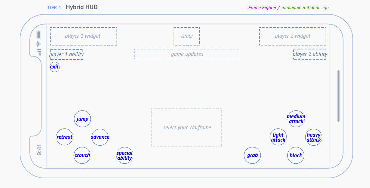
My wireframe for one of several (SEVERAL!) of Warframe Mobile’s many minigames, in this case, a fighting game
THE DO’S:
–
Map out Unusual Navigation:
To kickstart your game UI wireframing journey, get inside the player’s head. Consider a mobile game where users swipe to navigate levels or to get kitted-out in their favorite Roguelike. Identify key interactions that require unusual solutions and sketch those peculiarities. You’ll also need to map out “gating” gestures, like moving elements to the corner you don’t want touched accidentally.
Prioritize Clarity:
Clarity is king in game UI wireframing, especially for beginners. Imagine a console game where players need to distinguish between various weapons – all 32×32 and all of an angular, techy aesthetic. If they’re all longish pointy-ish icons that are indistinguishable from 10 feet away on a couch, you’ve caused a problem that, yes, could be solved as early as the wireframe stage. Use straightforward iconography, even at early stages, in your wireframes – perhaps a geometric shape as a framework for each weapon type (Triangular-ish, square-ish, circular-ish, etc). This simplicity ensures that fellow designers and stakeholders quickly understand your design, seeing it as a finished, futuristic product in their minds.
Consider Screen Real Estate:
Picture a strategy game on a tablet – players need space for a map, resources, and menus… and chat! Be mindful of screen real estate; avoid clutter by organizing essential elements by highest priority first, the working your way down the hierarchy as you develop. Easy money is on starting with health, or the equivalent stat that will end the game, then work on everything that supports keeping that number up, then everything that supports that. This thoughtful allocation ensures a clean and efficient game UI, enhancing the overall player experience based on need, not want.
Use A Visual Language for Icons:
Creating iconography for games is a bit like making your own hieroglyphics. You’re creating simple pieces of art that, when combined, create simple two word sentences: bonus health, negative armor, better attack, can’t cast, etc. If our game had a simple icon for Attack Up, the most obvious-but-boring choice would be a sword with an up arrow. To keep that visual language consistent, “Attack Down” would have the same sword, but a down arrow. Now… what about Defense Down? That’s right, with the visual language we’re crafting, it would be a shield and a down arrow. This approach creates a cohesive visual language, simplifying the learning curve for players who don’t want to rummage through lore videos to figure out your obscure icon.
Seek Feedback Early:
Heyyyyy, raise your hand if you’re a big old hypocrite! W… wait, why am I the only one raising my h- you know what, nevermind. Collaboration is the most incredible skill to have in game UI wireframing, and yes, it’s the hardest skill to master. On a game team, you’ll be presenting your work, ideally, on a weekly basis – especially in the early stages. Showing your work in midstream, even if its going well, is the most effective and efficient act you can do with your work. Imagine a wireframe where players interact in a team chat on a mobile game (a thorny problem, if you think about it). Seeking early feedback mid-week from many parties; Design, Engineering, Art, ensures constructive input, refining your wireframes swiftly. For instance, early feedback might highlight the need for 3 lines instead of 5, chat icons for intent, or removing the chat altogether, enhancing communication within the game interface.
–
–
–
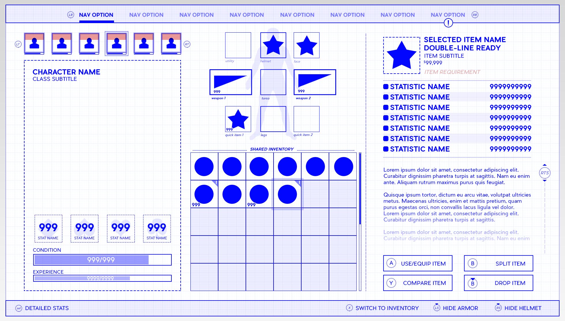
My wireframe for Wasteland III (Microsoft, InXile) that set the style for my wireframes after many years of research & development
–
THE DON’TS:
–
Avoid Ambiguity:
When it comes to game UI wireframing, steer clear of ambiguity like a foodie stays away from sketchy sushi places. Consider a scenario where your wireframe is trying to show a simple, plain, ordinary “Settings” icon – but you’ve lost yah damn mind and tried to something wacky like a heart or a email icon. Instead of a vague or nebulous image, opt for a big-standard cogwheel icon or hamburger icon, leaving no room for interpretation. Some pieces of art you’ll absolutely want to reinvent from the ground up… but a lot of this has been taught to the audience and needs no reteaching. Ambiguity can lead to confusion during meetings with Design and Engineering, as well as in implementation, so be explicit in your representations to ensure a seamless transition from wireframe to actual UI elements.
Don’t Overcomplicate:
Don’t let your wireframes become a tangled web of complexity. Picture a role-playing game where the inventory screen is an utter mess of labyrinthine navigation and rarity colors. A terrible inventory in that genre is tantamount to a terrible game – period. Avoid overcomplicating with unnecessary details; focus on fundamental UI aspects in order or priority, or what we all just The Hierarchy for short. In the wireframe, prioritize the placement of crucial elements like navigation, button prompts, item slots (attaché case or list) and descriptions (embedded or pop-up), then work from those elements to lesser elements. Simplifying your wireframes ensures that the core functionality takes center stage without overwhelming visual noise.
Steer Clear of Inconsistent Styles:
Consistency is your ally, so steer clear of a design language that resembles a patchwork quilt. Imagine a game where navigation buttons follow different styles, shapes or colors for seemingly no rhyme or reason. Imagine the utter confusion going in trying to make sense of the work in the first 5 seconds, then the first 5 hours. I worked on Rage for id Software, and it had no less than 5(!) different aesthetics in the UI. Even though that couldn’t be helped as was an intimate part of the worldbuilding – Don’t be like me! In your wireframes, don’t let inconsistency reign. Maintain a unified design language; if your wireframe features sleek, minimalistic buttons, ensure this style persists across similar elements. This consistency prevents confusion and preserves the visual harmony of your game UI.
Don’t Ignore User Feedback:
Ignoring user feedback in game UI wireframing is like sailing into stormy waters without a compass. Here’s a classic example for you: during testing, QA says there’s confusion about the weapon wheel. Some say it’s too many items on screen at once, others think there should be even more info like name, ammo, and stats. The feedback may not all be viable, but it’s all informative – and therein lies the dilemma: who do you listen to? Hmm? No, I ain’t got no answer! But you should listen to everybody, as it is, mercifully, the easiest part of your job.
Avoid Unrealistic Scope and Scale:
Imagine a character customization screen. Don’t let your wireframes include elements like extravagant customization options cascading on and on in technically or visually unrealistic ways. Instead, align your wireframe scope with the Player’s scope, that is to say, their inability to be overwhelmed. If the game’s scope allows for insane details in character customization, fine, but focus on realistic boundaries of comfort and legibility. This approach prevents complications during development and keeps your wireframes grounded in practicality.
–
CONCLUSION
Navigating the landscape of game UI wireframing as a beginner involves mastering the art of balance and clarity. By adhering to the do’s and avoiding the don’ts, you’ll set yourself on a path to creating effective, user-friendly wireframes that lay the groundwork for an exceptional gaming experience. It’s never about clean lines, perfect margins, or a tight grid system. It’s all about communicating the future in the present. Clarity of vision. As you embark on your wireframing journey, remember that learning from mistakes is as valuable as following best practices, contributing to your growth as a proficient game UI designer.