FREE GAME UI DESIGN COURSE FOR YOUR GAME UI PORTFOLIO
A GLOSSARY OF GAME UI UX DESIGN TERMS FOR ABSOLUTE BEGINNERS: THE HUD
 By John “TheWingless” Burnett
Game Art Director, Senior UI Artist, Remote Game UI Mentor
Need 1-on-1 help with your Game UI Portfolio? Join my exclusive Game UI Design Course!
A GLOSSARY OF GAME UI UX DESIGN TERMS FOR ABSOLUTE BEGINNERS: THE HUD
FREE GAME UI DESIGN COURSE FOR YOUR GAME UI PORTFOLIO
I’ve been teaching Game UI Design for a few years now, and one of the more embarrassing elements of the game Industry to admit is: very few of us are formally trained. The people my generation are almost entirely self-taught, and you can really feel this every time you share a Photoshop file with another designer and stare in amazement at the freakshow of a .psd before you.
And worse still: we don’t have standardized terms. Doohicky this, thingamajig that, the buttony-type-button…thing? You know what I’m talking about. Let’s try to correct terminology potpourri here with common, or at least, commonly accepted terms for elements you’re more than likely to see in a modern game HUD.
Editor’s Note: These are in alphabetical order, not order of importance to the HUD!
Ammo Display
Shows your weapon, ammo and any other associated information with your tools of the trade. Ammo displays can run the gamut of being quite plain, very graphic design-y, or eyebrow-raisingly strange. Ammo displays can become even more complicated if you have to factor in states like low ammo or no ammo, overheated or any number of other effects you can be under. Also, the placement of this widget can be particularly thorny in a 3rd person game like the latter-day Resident Evils, where the main character dominates a third of the screen!
Button Prompts
Button Prompts are on-screen cues guiding players on which buttons to press for specific actions. These can be on the HUD widgets themselves or in the game itself. In the old days, most button prompts were color-coded, helping the player with the easy color mnemonic. Over time that trend fell out of favor for monochromatic approaches – the Nintendo Switch in particular having no original colors to speak of!
Compass
The Compass is a navigational tool on the HUD that orients players by indicating directions. It is often represented at the top center of a screen, usually with cardinal directions and points of interest. As an interesting side note: most games have either a Compass or a Minimap, and the only genre I can think of that uniquely has them both is the Battle Royale genre.
Health Indicator / Health Bar / Health Meter
This goes by quite a few unofficial names, but essentially, the Health Indicator functions as the one single piece of information that matters on the screen. In fact, one technique I teach all my students is to start with the most vital parts of the screen, and wreathe your hierarchy around that, instead of throwing everything on the screen and hoping for the best. While these meters may function exactly the same as a Mana / Energy meter, you should treat Health as its own vital and unique element. Think of the other meters as numbers that support the most important meter.
HUD (Heads-Up Display)
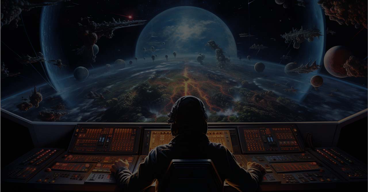
The HUD is your visual cockpit in the gaming world. It overlays essential information on the screen, including health bars, ammo count, and maps, ensuring you’re always in the know without losing sight of the action. HUD is a pretty all-encompassing term – but when a gamedev says HUD, we almost universally mean “stuff on the screen during the core loop”. So the puzzle area on a match-3 game is technically the HUD, as is much of the HUD-less Dead Space.
Low Health Indicator
A common element that has no real term, the Low Health Indicator is a visual cue that warns players when their character’s health is dangerously low. Nominally, this is the flashing red around the peripheries of the screen, but it can have other appearances too: the gear in the center of the screen in Gears of War, or BD1’s lights glowing from green to red when Cal Kestis is low on health in the Jedi Fallen Order & Jedi Survivor series.
Mana / Energy Meter
Another ill-named element you’ll see on many popular games, the Mana Meter almost always functions like the health meter… except when it doesn’t. For example, some games may have an abstract way of display health, like a red border at critically low health, but have a discrete way of showing mana, like crystals or in the case of Cyberpunk 2077, individual chips in the upper left that recharge one at a time. You may have multiple meters that function identically, like in Elden Ring, but this is hardly the ideal due to color blindness.
Mini-map
The Mini-map provides a bird’s-eye view of the game world. It helps you navigate, locate points of interest, and plan your next move. The mini-map can come in square or circular formats, and can be as minimal or painterly as the Creative Director and Art Director want. It should be noted that the artistic contents of a mini-map are not your responsibility as a UI Artist – but iconography definitely is, so make sure it gels against another artist’s work!
Objective Marker
The Objective Marker directs your attention to specific mission points or goals. It’s your in-game GPS, ensuring you never lose sight of the next objective. Most games take the path of least resistance on this one and simply have a floating icon in the world. But other games have run with this concept: think Bioshock’s floating 3D arrow or Dead Space’s objective path finder.
Objective Tracker / Quest Tray
The Objective Tracker is typically a indented list that guides your journey by highlighting current goals or missions. Traditionally, it floats on the upper left of the screen, showing Primary and sometimes Secondary objectives indented. How deep and detailed the Tracker can go is up to the team, but it’s more the responsibility of the UI Artist than not to call where the limit should be. RPG’s are notorious for having monstrously long Quest Trays, World of Warcraft in particular flooding you endless reams of text…
Onboarding
Onboarding is actually a huge umbrella term for Tutorials and how they’re doled out, and to what intensity – a real science all on its own. Onboarding may play a significant role in the HUD, especially in the beginning of the game where we have to show many lessons, rapid fire. These may be pop-ups, whole screen displays, something in-world — who knows! But one thing is certain: presenting how onboarding works is definitely your responsibility.
Pop Ups
We talked briefly about Onboarding, and Pop-Ups are usually how those tutorials are doled out. But Pop Up menus can also be used in a pinch for everything from weapon comparisons, messaging that doesn’t need much flourish (“This Door Opens Elsewhere…”), to “Controller 1 Disconnected”. It should be noted that when it comes to DLC, where Designers take your old systems and break them with new gameplay, most things are hacked-in with a Pop Up, making it indispensable all the way late into production for Engineers.
Reticle / Crosshair
The Crosshair is your targeting reticle, indicating where your shots or actions will land. Reticles tend to change shape depending on the weapon held, though this is not always a hard a fast rule. The same goes for Reticle effects, like when you hit an enemy. These can be further nuanced with things like enemy headshot indicators and enemy eliminated effects, as seen in Halo and Modern Warfare, respectively. Games like Doom Eternal, which has the UI challenges of a Rhythm game(!) and a Fighting Game(!!), have lots of iconography right by the reticle, as if acknowledging looking anywhere else in the heat of battle is to lose the war.
Scoreboard
In multiplayer games, the Scoreboard showcases team scores, individual scores, or anything that competitive players need to know at a moment’s notice. The speed at which you can disseminate information is paramount here, as the likelihood of the Player checking in the heat of battle is extremely high – especially in FPSs or Battle Royals! The Scoreboard can also have the opposite mood: the game has ended and now there’s a great relaxing sigh of relief as we look at the results of the last 20 minutes. Different emotional needs should have different screens!
Status Icons / Moodles
Status Icons (or Moodles as they’re called these days) are visual cues indicating your character’s condition, buffs, or debuffs. Moodles are an artform in themselves, and a challenge to turn into a visual language. You may be surprised to discover just how deep the considerations of a moodle go, for example: do you have a timer for when they end? Is that visual or numerical? How do you show positive versus negative moodles? What if its a permanent effect, how do you differentiate that? Caused by an item? A shrine? A story element?
Subtitles
Subtitles display in-game dialogue as text on the screen, providing accessibility for players with hearing impairments or for those who prefer to read the dialogue. An absolute requirement for your game to ship, and your responsibility to figure out where that bad boy goes (spoilers: down center). A minor consideration, which is the problem – its very easy to forget and put all the other elements in first!
Weapon Wheel / Quick Select Menu
A large and complicated widget, the Weapon Wheel allows you to make vital changes to your weaponry and gear without clumsily going through the main menu. These widgets become complicated quickly given they 1.) have to show all the info from the Ammo Display and 2.) Have to do it among reems of other information and 3.) do it all against a background where the visual action is at its peak! Most weapon wheels are circular, true to the name, though there is one exception I know of called a Weapon Spiral in the game Prey, which is as unique as it is wonderful.
A game HUD is, admittedly, a much larger topic than a single glossary can cover. Minor widgets, gameplay changing additions, strange interactions with core loops – the HUD is practically haunted. But with a standardized series of terms of HUD essentials, you’re equipped to dive into the immersive world of Game UI Design. These terms are your gateway to understanding and mastering the interface that shapes your gaming experience. Happy exploring!
