10 Simple ways to Improve your Videogame Inventory Screen
10 SIMPLE WAYS TO IMPROVE YOUR VIDEOGAME INVENTORY SCREENS
 Art Director John “The Wingless” Burnett
10 SIMPLE WAYS TO IMPROVE YOUR VIDEOGAME INVENTORY SCREENS
GAME UI DESIGN COURSE
FIRST EDITION
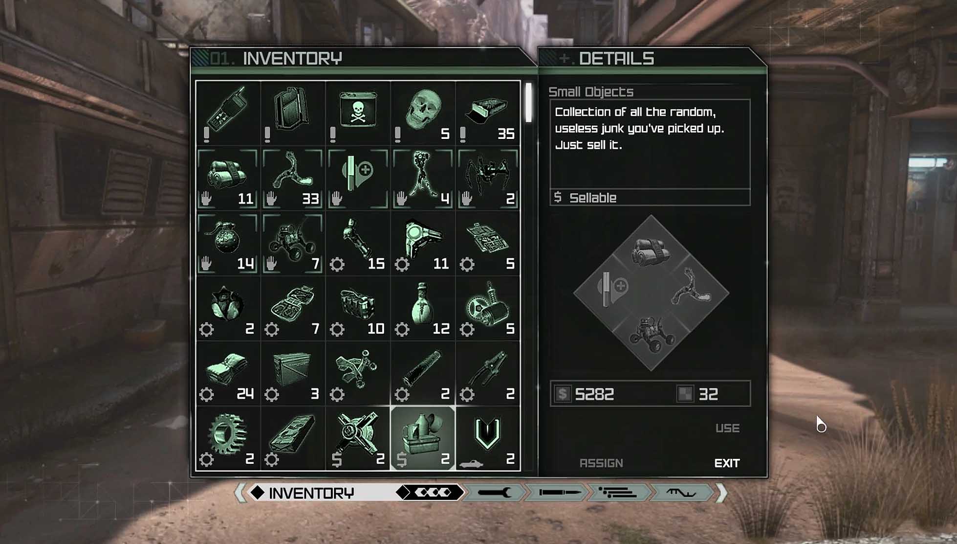
I remember the thorny annoyances on working on the Inventory screen for Rage (id Software). Part of the conceit was the UI was computer-screen green, which was fine… until we had to showcase healing items, throwables, consumables, and quest items. We stumbled into Design cul-de-sacs, fell down rabbit-holes and ultimately hacked in temp solutions that made it past the finish line.
If you’re a relatively new UI Artist or are taking up the duties on your indie game, you’ve probably realized just how deceptively hard interface design is, too. Not only do you have to balance UI and UX, but texture budgets, loading times, and responsiveness. It’s a house of cards, and any one element could bring the other down.
Nowhere is this better felt than in your game’s Inventory screen. Traditionally, the inventory is the most complicated screen in the game, which is unfortunate, since it’s also the most-visited page in the game (second only to maybe the title screen). But no worries, there are a few ways to easily shore things up for the better, regardless of your UI UX skill level.
10 SIMPLE WAYS TO IMPROVE YOUR VIDEOGAME INVENTORY SCREEN
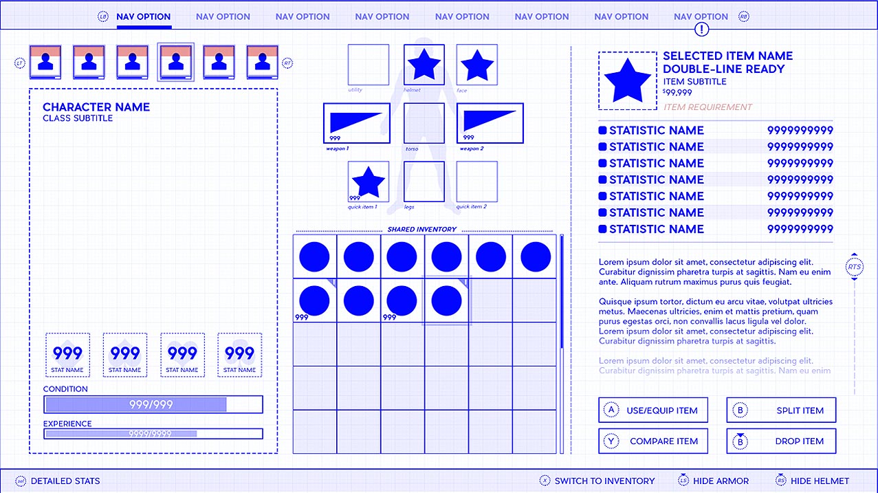
SHOWCASE HIDDEN STATS & RESOURCES
Have a stat that’s inappropriate for the HUD or a widget that fades over time? Showcase it in your Inventory screen. For example, soft & hard currencies usually show up in permanence on the Inventory.
If you gate your items by level (i.e. Level 23 or Heavy Weapons VII required), be sure to surface those gating stats somewhere on the Inventory, as well. If that’s impossible, be sure to give your items obvious visual tells that they are unusable… and why!
As a general rule, if any stat or resource gates the use of an inventory item – or if an inventory item can influence those stats back, always surface those numbers here.
ALERT THE PLAYER TO FORGOTTEN UPDATES
Badging (for the sake of simplicity, think a circle with two digits inside) is a simple and effective way to remind your Players of information they’ve completely forgotten.
Badge your navigation options in the Header to show updates to the Inventory, Character & Quests
Be sure to badge new items in your Inventory! If there’s any one quality-of-life improvement that will instantly improve your project, it’s remembering what you just forgot!
TRY TO LIMIT THE WAY THINGS SCROLL
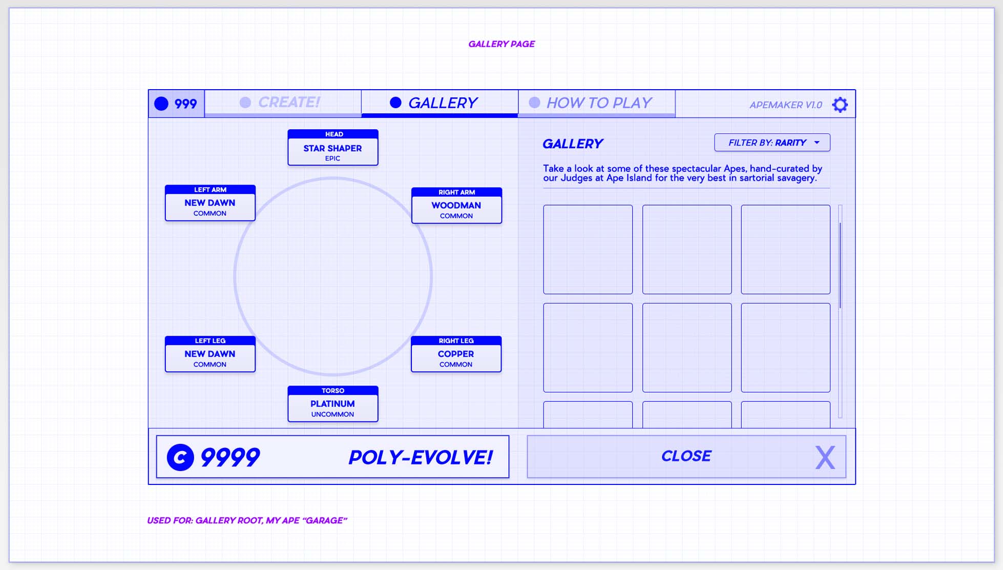
As a general rule, I try not to have two scrollbars on the same screen. Two scrollbars are visually and technically confusing… and just looks trashy as hell (spittoon sound effect).
You can try to sidestep this by pairing your text fields with scroll bars, and your inventory system (a grid or list) with a pagination system.
In dire situations where you must use two scrollbars, see if you can arrange one vertically and the other horizontally.
THINK SUPERMAN & CLARK KENT FONTS
Control typographic complexity by going simple and only using a Title Font and a Body Font.
Your Title font should be used in large sizes and have the “personality” your game is going for, but not at the expense of legibility! Stay safe: grab a sans-serif font. Sans-serifs don’t have those “fiddly-bits” at the end of the letter.
Your Body font should be comparatively boring and read well in paragraphs at small sizes.
Think of your fonts like Superman and Clark Kent. One is supposed to change the world, the other is just supposed to blend in.
HELP CONSOLE USERS NAVIGATE
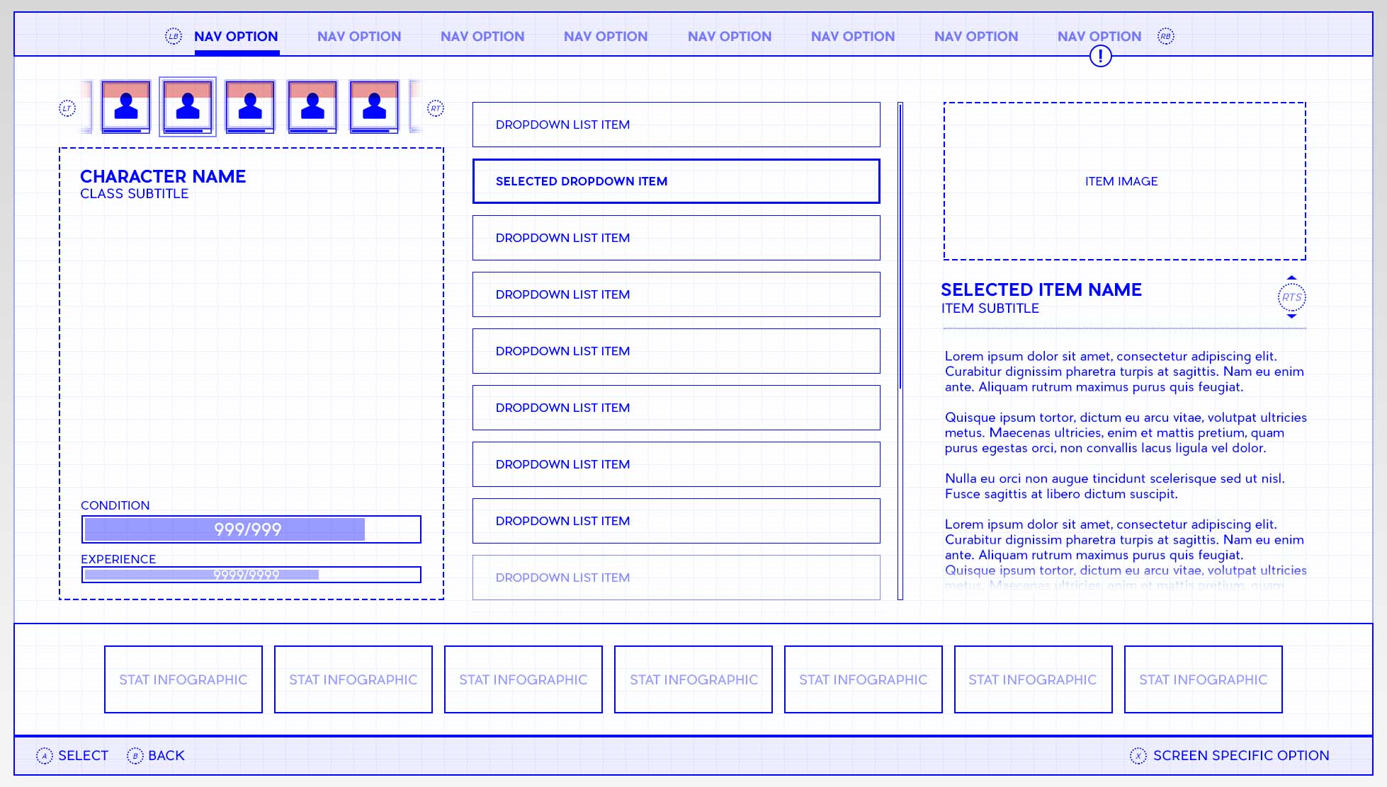
Controllers need special love: use the highest shoulder buttons to tab through navigation on the Header. Be sure to include your button prompts! If you have a sub menu (like a Filter system), use your lower shoulder (trigger) buttons to emulate the difference in elevation.
If you run out of face buttons remember: you have click-in sticks! Think about using them for Hide Helmet or to quickly jump between screen spaces, like from the grid to the “Paperdoll” to equip items.
Steer away from emulating a mouse-like pointer on a controller – it’s inefficient and frustrating for the Player who is now only as fast as your slowest Interface.
THINK ABOUT EACH CELL IN THE GRID
Grids can get very noisy, very quickly, so make sure your iconography is large and artistically legible so the Player can form a mnemonic from the detail.
This also implies tight control over the total number of cells in the grid. Low frequency of pickups? A 64×64 paginated grid would be overkill. Dozens of items every 5 minutes? A scroll list showing 4-per-screen would be infuriating.
Save a corner of a cell for Badging that the item is new. Watch out – some of your items may have quantities, so save another corner (possibly the bottom center?) for three digits.
Even presuming one corner is used for badging and another for quantity, you also have two other corners you can use to badge!
Color-code or otherwise treat individual cells so that the Player can identify them at a distance and en-masse. Maybe healing items have a faint green tinge on the background square. Weapons always have a thick metallic border? Did you make sure gated items look appropriately unusable and show unambiguous messaging as to why?
DOES THIS REALLY NEED TO BE HERE?
Your inventory screen is busy enough, so the screen that benefits the most from prunings and audits will be this one.
Quest items that cannot be used likely shouldn’t be shown at all, unless they have some lore to provide – and even then – consider what an unworkable cell in the Inventory adds to the experience.
Does ammo need to take up a cell, or can it always persist and be counted en masse like any other resource?
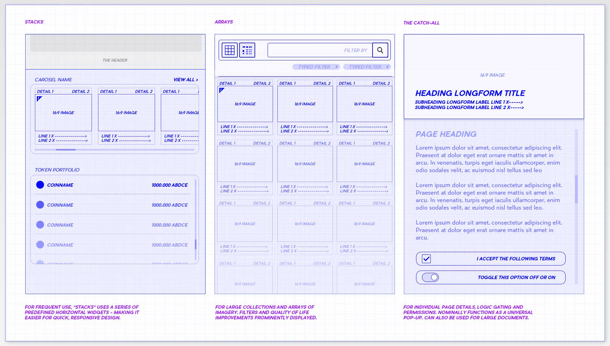
If you have a massive section of the screen dedicated to small item descriptions, would you be better served with a call-out style pop up?
Conversely, if your pop-up is overflowing with numbers and scrollbars, have you considered dedicated screen space for this great undertaking?
WAIT, SHOULDN’T THIS BE HERE?
If you have items that are gated by level (or an item that gives experience), you should definitely show Experience Points on the Inventory screen
Using a traditional grey-green-blue-purple-orange rarity system? Make sure those colors are surfaced somewhere… without looking like an open bag of skittles.
Does a weapon take a specific ammo type? Show it on the item’s cell and think about a color-coded icon.
If the Player equips a new item, don’t forget to show how the stats will change before they commit to that change.
If I’ve slotted an item to the digital-pad, you’ll need to surface what that setup looks like and allow the Player to edit it on the fly.
If your Inventory is more of a Tetris-style organizational meta-game, think about an auto-sort feature.
If your breadth of Inventory items is sufficiently large, you should definitely have a filter system.
KEEP THINGS MOVING SMOOTHLY
Instead of a jarring pop-up to confirm an important decision, what about a tap and hold function for certain lesser considerations?
Transitions and screen effects should happen AFTER the functional parts of the screen are ready and never impede Player interaction.
As an easy mental guide, construct your UI UX around speedrunners
Dedicate a button to close the entire Shell Menu down and return to the game (yes, many games forget this!).
Your Player will spend the majority of their time in Inventory – for better or worse – so make sure textures load swiftly and the Player can navigate cleanly.
USE YOUR INVENTORY TO TEST YOUR GAME!
Inventory management will never be fun, so explore your game through the tedium you have to wade through moment-to-moment, not just the highlight reel in your head.
Figure out just what kind of pace your game has:
Will the Player be coming to this screen in a wild panic to heal or buff? You might need a toolbar, quickbar or dedicated button.
Are they careening around lists and grid cells trying to find one specific thing? You may need a filter or auto-sort feature.
Are they coming to the Inventory to use one item regularly and frequently? You may need a quick-item function!
BECOME A UI ARTIST IN VIDEOGAMES WITH MY PRIVATE USER INTERFACE DESIGN MENTORSHIP PROGRAM!
THE GAME UI UX DESIGN NEXUS
Hey there! I’m the guy that wrote this Blog. In addition to giving away lots of free insider information about being a game UI Artist – I also run a 1-on-1 Mentorship program that teaches you how to break into the game Industry through UI Art and UX Design. With my game UI Design course, everything is bespoke: the projects, the pacing, and the potential. If you’re tired of trying all on your own – or finally want to take control of your future, check out my remote UI Design course. Monthly and hourly consults available!
