How do you make a Video Game UI UX Wireframe Example – Wasteland 3 RPG Inventory Screen
HOW DO YOU MAKE A VIDEO GAME UI UX WIREFRAME EXAMPLE
WASTELAND 3 RPG INVENTORY SCREEN
HOW DO YOU MAKE A VIDEO GAME UI UX WIREFRAME EXAMPLE - WASTELAND 3 RPG INVENTORY SCREEN
VIDEO GAME WIREFRAME STUDY AND POSTMORTEM
FIRST EDITION
This Blog is a living document that is being updated in real time. Check back often for updates and pardon our dust!
–
I had the privilege of working with the team at InXile Entertainment and Microsoft developing the Role-Playing smash hit Wasteland 3 for PC and Xbox.
Wasteland 3 is a unique fixture in modern RPGs… in that it’s not modern at all. Wasteland is an old-school pen and paper RPG Franchise from the era of floppy disks and colossal beige monitors. Imagine the challenge of trying to bring an 80’s RPG kicking and screaming on to sleek modern consoles – But wait… there’s more!
Wasteland 3 is also a console-first RPG, which is challenging enough. But if there’s one client in the world that expects an amazing console port… it would be the makers of the XBOX! Microsoft was an ever present fixture on the project, and publishers, especially powerful ones are always an interesting addition into the mix. A pen and paper RPG running on a controller with a Fortune 21 overseeing things – where do you even start?
For now, let’s start with the Inventory Screen.
HOW DO YOU MAKE A VIDEO GAME UI UX WIREFRAME EXAMPLE
WASTELAND 3 RPG INVENTORY SCREEN

THE OVERVIEW
A modern game Menu System has what I like to playfully call “Hamburger Design” – bread, meat, bread. That is to say, a header for navigation, a middle section for content, and a footer dedicated to button prompts. This isn’t necessarily a hard and fast rule as, “These be more guidelines than rules, Jack” – but with the extraordinary challenge of pen-and-paper information design, I wanted an early advantage.
The first, most obvious challenge in designing Wasteland 3’s UI was translating an abundance of old-school pen and paper information on limited screen space without the benefit of a mouse or a keyboard.
Now, you may consider “ain’t got no mouse and ain’t got no keyboard” a minor setback, but using a controller for these kinds of screens is a knotted logical problem. Consider this wild enigma of game design: the control method is the screen. With a mouse, you don’t need certain prompting and elements can be uniquely svelte. But with a controller, you are limited – forced into compromises – and are otherwise hamstrung by a paltry dozen buttons or so. To put that into perspective, a modern keyboard still has two shift keys, and I can’t think of any degenerate who uses the rightmost one.

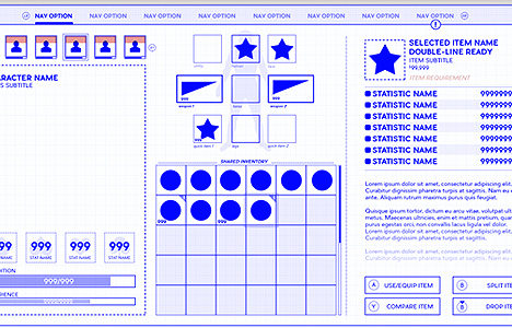
THE LEFT SIDE: PARTY STATUS
The first challenge in developing a game Inventory Screen is always the same: organization. Specifically, organizing information into something reasonably logical – and then hammered into something reasonably attractive.
To manage the information design of a very complicated RPG Inventory, I dug into the good old Gestalt Principle: grouped items are perceived as similar. Since your selected Character, the squares on the top, informs the details for the rest of the screen, it clearly has the highest priority, and is an easy contender for first placement. Once I know the most important element of the screen, in this case, the element that will influence every other element, I design from that point. Sort of… paint out from that point.
In fact, you can see the logical hierarchy flowing from left to right: the character to their resources to details about those resources. From gross detail to fine.
I also used basic perceptual psychology to recognize we read left to right, top to bottom here in the good old West. Using that methodology, I made sure that important widgets were featured first either in the left or the top, descending in priority towards the lower right. Not always, and certainly not slavishly, but again, Clever Jack, as a guideline.
The Character’s Primary Stats, represented as those Card Suits in the squares, was a bit of an awkward compromise. Wasteland has 4 primary stats, so I figured if I just arranged them in a line, added some iconography in the back, it would just sort of… work itself out. I’m not necessarily sure it did, but we’ll talk more about that at the end of this postmortem. Suffice it to say, there wasn’t any other place to put them, though I suspect Me as I am now could’ve come up with a much more creative use of the space.

THE MIDDLE: THE INVENTORY
The middle section is what I feel is a rolling series of UX compromises, one due to console controller limitations, the other due to the unknowable nature of Inventory screens… and how they shake out over dozens of hours of gameplay.
You see, every game needs to be balanced, mostly for combat. But few designers balance their game’s loot system… with the User Interface. That is to say, few designers consider how annoying or frustrating or baffling their game is at a mechanical level. Designers have to think abstractly and conceptually about gameplay, and everything flows smoothly at a conceptual level. At a mechanical level, where those abstract ideas are given shape, that’s where everything tends to fall apart real good.
Our job as UI UX Designers is to make sure a Designer’s idea is a silky-smooth experience free of frustration. Concepts like grey loot, item hunting, inventory management – it’s all tedious to the player, as evidenced by all the innovations like Filters, Sell All Buttons, Quick Use Items and the like.
So the compromise was a litany of small concepts: a huge inventory grid (which I believe was shrunk significantly in production) and a “best-I-could-Do” Old School Paper Doll configuration up top.

THE RIGHT: THE DETAILS
The rightmost section contains the details of whatever you have selected in the Inventory, and by details, I mean old-school reams of the stuff.
Remember that brief aside about balancing an Inventory over hours of gameplay? A challenge for UI is presuming the mean / median feeling of a system, while also designing around its max and extremes. Or put another way, you have to design around the most average experience on the screen… but you also have to think about every extreme outlier for a system and bizzaro-user.
As a result, it’s very important to understand game Screens and Systems in their totality. But… if you can’t… to hell with ’em. You can always make what I playfully call, “Designer Agnostic” systems and screens. The entire Details Panel on the right is one such system; requiring absolutely no intimate knowledge of the game, it’s systems, or its quirks. Whatever the coders and designers can conceive of, the system can handle. It’s just a big ass text field with logical propagation of the information and some tight typography.
The buttons on the bottom right are the most severe compromise. Some features change wildly depending on what you have selected. Like bullets, for example. You can drop 1, but not split 1, but not equip. You can drop a weapon, but not split, and equip… Every item has these “dither swithes” off and on, and it just made more sense to have them in a place where you would want and expect them.
MY ASSESSMENT
WHAT I LIKED
The Wasteland 3 Inventory Wireframe started my love and devotion to that “Hamburger Design” of bread, meat, bread – or header, content, footer; something I teach all my students when they try to tackle their first few modern menu designs. Hamburger Design kept Wasteland 3’s vast information architecture easy to work with, and therefore, easy for an audience to parse.
I also love how neat and tidy the wire ended up. And not to toot my own horn by, ah-toot-toot: a former student even sighted the Wasteland 3 Inventory wireframe as “gorgeous”. Who knows how many people have, for better or worse, taken wholesale inspiration from the wire for their own UI UX work. For worse, because sometimes you evolve past your most monumental work, and hey, speaking of which-
-In spite of my dire warnings against it (to future students), dividing the screen into equal thirds worked out well. A classic case of “don’t cross the streams”, you usually don’t want equal divisions of the screen because you rarely have information of equal importance. Wasteland 3, mostly due to its abundance of stats, worked out well in an equal thirds configuration.
Still, I don’t think I’ve ever broken an Inventory or any game screen into 3rds after Wasteland 3.
WHAT I DIDN'T LIKE
The Paperdoll / Inventory just seems a knotted series of compromises. Cramped, fiddly on a controller, and downplaying the parts you’d love to see played-up. I feel the middle strip could definitely use another pass. And it did… this Wire went through many iterations as memory serves, ultimately ending up as a thin strip on the bottom in two lean rows.
I also feel the toggling Button Prompts on the lower right are overdesigned, though I can’t remember if this was a design requirement on their end or my own monstrous creation. Let’s presume the Toggling Button Prompts were a necessary evil borne of Old-School game design thawing from its ice block in the modern age. But if such a complicated design is needed to enjoy your game, surely the old-school should be the one to compromise…?
Which brings me to my final professional gripe: too much Old School nonsense. I’m as old-school a Commodore 64 and Atari gamer as they come and look gang, I never liked Baldur’s Gate and I never liked Planescape Torment. I’ll spare you how I feel they’re great novels set to tediously bad tactics games and instead warn you that old school RPGs are steeped in information overload.
Modern game design moved away from intensely numerical systems because only PC gamers back in the day would dare engage with such complexity and tedium. As games advanced, so too did the need for a broader demographic who were far more sensitive to annoyance. The majority wanted immediacy and intimacy, and try as you might, you won’t be able to make a spreadsheet sexy to that demographic.
WHAT I WOULD'VE DONE DIFFERENTLY
No more Equal Thirds. My Mentorship taught me that over dozens of menu designs, rarely will you have information of equal weights. Since contributing on Wasteland 3, I’ve completely changed my stance on Menu Design – becoming a devotee of the Golden Mean: one-thirds over two-thirds. Now, I’m not entirely sure the Golden Mean would’ve worked as well on Wasteland 3, but I do know ever since Wasteland 3, I haven’t used equal thirds at all.
More creative treatments. Real talk: this was a contract, which means when the Creative Director says something, you nod and count the cash you’re making in your head. In my experience, Creative Directors in charge of old-school RPGs tend to be the rights-holders of those 80’s and 90’s era properties. And not to paint in broad stereotypes, but those Directors don’t just try to pay homage to the old-school, sometimes they rarely leave it. For a modern UI UX Designer, the old school is violently offensive – and negotiating the old and the new could’ve been done widget by widget. Instead, I kinda… focused on the cash and became an Art Mercenary; happy to just let them handle their war after I was done.
Less detailed Wireframe. This may seem like a bizarre concept in a Wireframe postmortem, but bear with me. A wireframe, at any stage of development, is a crystal ball; a vision into the future. The more actionable information you can glean from the future, the better. Bonus points if you can do it for very cheap or with little effort. A wireframe that is overdesigned is different from one that is detailed. Detail is exceptions, modals and context. Overdesigned is simply impressing a Client for the sake of another contract. This Wireframe “style” is my own invention, something I made specifically for one-off clients to impress them and turn them into longterm clients. I rarely, if ever, give wireframes at this level of ornamentation (but just as much detail).
WHAT YOU CAN LEARN FROM THIS
Working with InXile and Microsoft was fun and lucrative, sure, but Wasteland 3 is something of a landmark project for me, as it informed much of my standards in game Menu Design. From Hamburger Design to Golden Mean, many of my design mainstays originated from this project.
But for you, the most obvious thing to learn is, finally, somebody posted a professional Game Wireframe.
The next thing to observe is how complex an Inventory screen can become. Granted, Wasteland is an old-school RPG on a console that requires enormous compromises and ingenuity. But even so, Inventory Screens tend to represent the most complicated part of any game. The first order of business is structure that takes its queues from the Hierarchy. No, not a visual Hierarchy, a usability one. Each game is unique, even (and sometimes especially) within its own genre. Don’t make boiler-plate solutions for game UI, it’s all gotta be bespoke.
The last thing to remember is UI UX Design in games is complicated and fraught with external factors: Creative Directors, Art Directors, Deadlines, Electronic Shows, Milestones… they all throw unique kinds of monkey wrenches into the mix. The easier your work is to make, the easer your work will be to understand by an audience. Ingenuity, therefore, is getting what’s in my head in your head with as little a loss in translation as possible.
And, of course, work hard to please your Client’s eyeballs.
BECOME A UI ARTIST & UX DESIGNER IN THE VIDEO GAME INDUSTRY!
THE GAME UI UX DESIGN NEXUS
MY PRIVATE 1-ON-1 DESIGN MENTORSHIP BOOTCAMP
Hey there! I’m the guy that wrote this Blog. In addition to giving away lots of free insider information about being a game UI Artist – I also run a 1-on-1 Mentorship program that teaches you how to break into the game Industry through UI Art and UX Design. Stop getting blind-sided by rejection letters and struggling all alone. Get your dream job, join my Mentorship!