7 Obvious Beginner Mistakes in your Video Game’s HUD (from a UI UX Art Director)
7 OBVIOUS BEGINNER MISTAKES IN YOUR VIDEO GAME HUD
7 OBVIOUS BEGINNER MISTAKES IN YOUR VIDEO GAME HUD
GAME UI DESIGN COURSE
FIRST EDITION
A videogame’s UI and UX has an immediate and lasting impact on gameplay, production, and the bottom-line. So… where are all the guides and best-practices for the most important Art in the entire game for the up-and-coming UI Artist? Shouldn’t there be a primer somewhere? Some kind of shorthand? Don’t worry, I’ve got you covered with seven ways in which you are messing up your game’s HUD… and hopefully how to fix them (?).
Oh, you may notice as we talk that there aren’t a whole lot of real-world visual examples. That’s because, as a matter of principle and professional curtesy, I never feature another professional’s work in the negative. I’d be mortified if anyone used my work in the black-and-white part of the infomercial, and I’d like to presume that dignity has been extended to me for decades… because I’ve made some real stinkers in the past. So, as a matter of ethical blogging, no examples of terrible videogame HUD design.
7 OBVIOUS BEGINNER MISTAKES IN YOUR VIDEO GAME HUD
MISTAKE #1
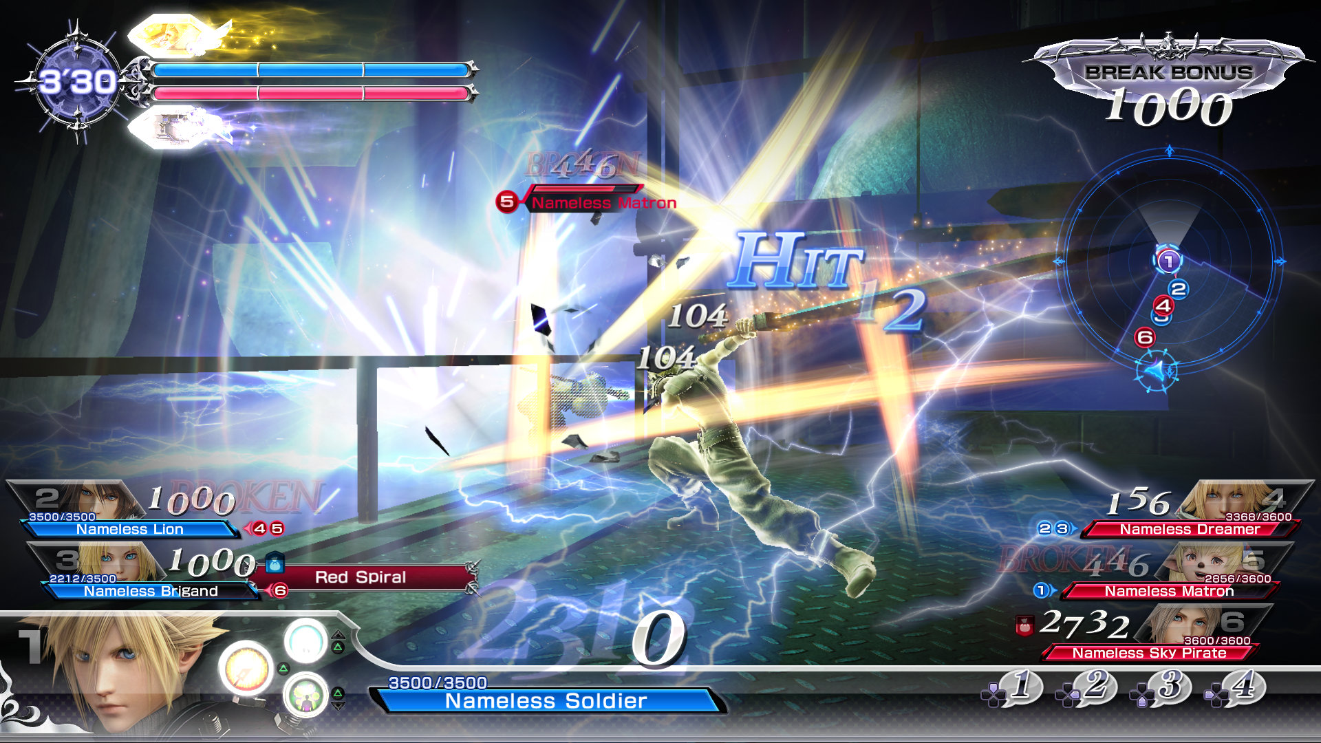
YOU PUT WAY TOO MUCH ON SCREEN
If you are adding more confusion than clarity, you’re not providing much in the “Heads-Up” department. Let’s try a more tempered approach to throwing in the Kitchen Sink.
Some information can be opt-in; informing the player only as they need to know it. For example: shop prices that are inset on buy buttons, click-and-hold commands to read a full note rather than a snippet, complicated weapon stats distilled to a singular DPS value for rapid decision-making, etc. All information can be “rounded down”.
Some information, once learned, does not have to be relearned immediately – if at all. That means some UX widgets can fade over time, or never show up under certain conditions, for example: hiding combat UI outside of encounters, or giving tutorials a [Do Not Show Me Again] button.
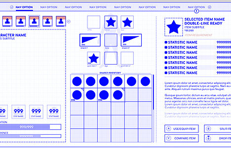
Traditionally, UI Artists use a Wireframe as a “blueprint” to see where elements will go on the screen as early as possible. Don’t know how to wireframe? No problem, write a list of everything you want on the HUD. Now assign it a number based on its importance to the player. This is your Hierarchy, and important tool in videogame UI Design. Build the high priority items first and then build secondary items around this new foundation. Another way to use Hierarchy is to keep removing low-priority items until there is a measurable impact on gameplay. After all: if there’s no impact, how important could it have been?
MISTAKE #2
YOU DIDN'T TEST EARLY AND IN-CONTEXT
Every HUD functions perfectly well in Photoshop on a 16:9 screen against a black background. Unfortunately, your UI designs will collapse in any other context.
Superimpose wireframes or even sketches of your HUD on top of screens representative of the average-ish experience. If you can, place an overlay of your wireframe over a movie of the game to get a sense of how motion affects the design.
For console games, test legibility for text and button prompts at an appropriate distance from the screen. For mobile games, shrink your compositions down to a mobile-equivalent size or better yet, save out screens to look at on your actual phone.
Test for your game’s unique feel and gameplay. If you’re making a fast-paced Royale game, having a densely-packed HUD like World of Warcraft would work against reactivity and awareness. Conversely, a 4X strategy game might feel infuriating with an ultra-lean HUD with no reports, updates, or maps. Your videogame HUD is a direct reflection of unique gameplay and specific frustrations – make sure your testing is equally bespoke.
MISTAKE #3
YOU'RE ROCKING BAD TYPOGRAPHY
Typography in videogames is a difficult skill to master, but strong game interfaces are borne on equally strong wordcraft – which thankfully can be distilled into a few easy tips.
The easiest way to shore things up is to stay simple and consistent. Pick two fonts: a title font and a body font. The title font should be used for Headings and… well, Titles (you can also use all caps on these, typically). The body font should be legible at small sizes and in dense paragraphs
When in doubt, pick a sans-serif. Serifs are all the “fiddly-bits” at the end of a font, and they’ll make your screens take a legibility hit. Sans-serifs, on the other hand, are the trusty workhorses of the digital world and friend to the common-man’s sight. In fact, take a look at a few games (after this impressive and informative blog!) and explore just how little serif-fonts are used in game UI designs.
Invariably you’ll need to make the text on your HUD pop during hectic gameplay. Dirty temp-fixes include adding a black stroke around the font or a dark, faded polygon behind illegible areas. While these fixes are hardly ideal, you may have to humble yourself before the idea that sometimes there is no elegant solution to the classic UI design problem of “make text read on a violent rainbow”
MISTAKE #4
YOU'RE USING COLORS LIKE A MADMAN
Speaking of rainbows – thoughtless color choice can make a monochrome wireframe unravel before your eyes in-game. Let’s make the colors work for us, not against us.
Make the colors a part of your toolset. Ensure navigation buttons have one consistent treatment. High contrast and vibrancy draws the eye, whereas darkness and desaturation dials details down. Use this to showcase areas of importance and clamp down needless distraction.
Try to only have one “Hot-Action” color, a color that is meant to specifically draw the eye. This Hot-Color can be used for everything from highlight states to titles and other important interactions. Even if the color palette for your UI is kaleidoscopic, make sure the Hot-Action color is consistently and purposefully used through the entire game.
As a general rule of thumb, try not to make your entire HUD red. Yes, there are professional exceptions to this rule, but it is also exceptionally challenging to work without red for concepts like cooldowns, iconography (blood vs. poison vs. water vs. oil), alerts, etc. Whether you’re junior or Senior, give yourself more opportunities than handicaps.
MISTAKE #5
YOU MADE SOME REAL UNSEXY MATH
Sometimes a UI is called a GUI, or Graphical User Interface – emphasis on the Graphical. Plain numerators, denominators and text strings simply will not do. Remember, the emphasis is on UI Artist.
Is there a more interesting execution for the information you’re providing? Instead of numbers, what about a meter, a toggle light, haptic-feedback, a voice-line? What can you represent sensually that will make it easier (not more obtuse!) for the user to comprehend in a wild moment of gameplay? Can you combine multiple ideas to make the feedback even stronger?
Shockingly (to everyone but UI UX Designers), information design is also an intimate part of the feel of the world. Do critical hits feel meaty? When I’m poisoned, am I anxious or is this all business as usual? When I level up, is it anything worth celebrating? Game UI UX design is as much performance art as the voice acting and the motion capture.
See if you can push these UI UX concepts even further. Can you show a Mech’s 5 stats in a Pentagonal Radar Chart? Wouldn’t the timeline be much more emotional as a scrolling trail of polaroid with the events hand-written on the bottom? If critical hits can get special treatment, what if we also scale down the size of the font based on how much damage the armor mitigated? Information design is worldbuilding!
MISTAKE #6
YOU'RE CLUMPING OR SPACING TOO MUCH
Ah yes, the great dilemma in game HUD design: do you clump widgets together in a corner, or scatter them to the four winds? There are a lot of factors, but let’s dumb it down to a simple ruleset for the burgeoning UI Artist.
Elements of equal importance or elements of a similar species should be clumped together: health, mana, stamina – these are all important resource pools that influence player behavior. Ammo, a lesser concern in the Hierarchy, would be inappropriate to clump together with Health, as would tertiary concerns like abilities, perks, quests, etc.
On the other hand, spacing elements everywhere is equally problematic – causing the eye to recklessly pachinko around the screen. If you are going to space things, try to balance your composition with equally weighted elements on the left and right, like health on one side, ammo counters on the other. Whatever you’re doing in the upper corners, make sure they coral similar information: Mission updates and story details by the Quest widget, location and geographic updates by the map.
You may also want to consider Naturalistic design; the idea that there shouldn’t be any 4th wall-breaking videogame HUD at all. Is there information you can imbed on the Player’s body or in the world? Is there a… well… more natural way to find things out like how many arrows are in your quiver, the condition of a sword, or the relative lethality of an enemy? How would you get the information if you were really there?
MISTAKE #7
YOU DIDN'T THINK ABOUT THE MEDIUM
PC games boast a panoramic amount of screen real-estate and superior controls. Icons can be microscopic and you are guaranteed most people will be sitting less than 5 feet from your work. Make sure the “button prompts” you’ve designed for left, right and especially middle mouse buttons read well (my mouse has 8 supplemental buttons that games absolutely have UI button prompts for!).
Console games presume the presence of a controller, which sometimes demands innovation in navigation and interfacing. Presume your audience can be as far as 10 feet away from your button prompts and typography. Iconographers be warned: Playstation buttons can turn illegible at a distance and Nintendo Switch buttons are color agnostic. It’s also rare for a Studio to make PC game exclusively, so if you’re making a PC or console videogame, odds are you’ll be making a hybrid design.
Mobile gaming is a very difficult platform to make UI UX Designs for, especially the HUD. All of your iconography disappears when there’s a thumb over it, there is no tactile feedback from “buttons”, and all UI designs suffer on a screen the size of a playing card. Also consider the incredible challenge of designing for a screen where you always cover up to 33% of it at any given time. Always test your mockups on your phone!
As a great champion of VR, I can easily attest that the hardest medium by far to design for is Virtual Reality. Each controller/headset boasts a wild range of capabilities – as do the human bodies they are rigged to. You may need to go beyond button prompts into full-blown gestures, and quality-of-life improvements are actually impressive accessibility concerns. If you’re looking for a real UI UX Design challenge, your no-hit pacifist-run awaits you in Virtual Reality.
But regardless of what medium, platform, style or age your are designing in, remember this axiom above all others: always work backwards. See your product with crystalline clarity in the context that it will be used – and see if that doesn’t change everything. And if not – you can always make a second HUD.
BECOME A UI ARTIST IN THE VIDEO GAME INDUSTRY IN MY PRIVATE 1 ON 1 MENTORSHIP PROGRAM!

THE GAME UI UX DESIGN NEXUS
Hey there! I’m the guy that wrote this Blog. In addition to giving away lots of free insider information about being a game UI Artist – I also run a 1-on-1 Mentorship program that teaches you how to break into the game Industry through UI Art and UX Design. With my game UI Design course, everything is bespoke: the projects, the pacing, and the potential. If you’re tired of trying all on your own – or finally want to take control of your future, check out my remote UI Design course. Monthly and hourly consults available!


