Free Game UI Design Course: Game Wireframes & Genres
FREE GAME UI DESIGN COURSE FOR YOUR GAME UI PORTFOLIO
GAME WIREFRAMES & GENRES
 By John “TheWingless” Burnett
Game Art Director, Senior UI Artist, Remote Game UI Mentor
Need 1-on-1 help with your Game UI Portfolio? Join my exclusive Game UI Design Course!
GAME WIREFRAMES & GENRES
FREE GAME UI DESIGN COURSE FOR YOUR GAME UI PORTFOLIO
Not all games are created equal, even within the same genre. Hell, two different Call of Duty games can have dramatically different UI’s for nearly identical gameplay features. Game interfaces can have vast and fine nuances between and inside of genres – nuances that will definitely make or break you during the interview phase if you’re shooting for a gamedev job. Humbly, the best way forward is with a rock solid 1-on-1 Mentor, but if you simply must go it alone, no worries – we’re going to delve into strategies that cater to the specific demands of those various game genres — and like I always tell my Game UI Mentees: don’t ever talk about art without art present! So here is a wealth of real game wireframes to deconstruct while we talk about wireframing for specific genres!
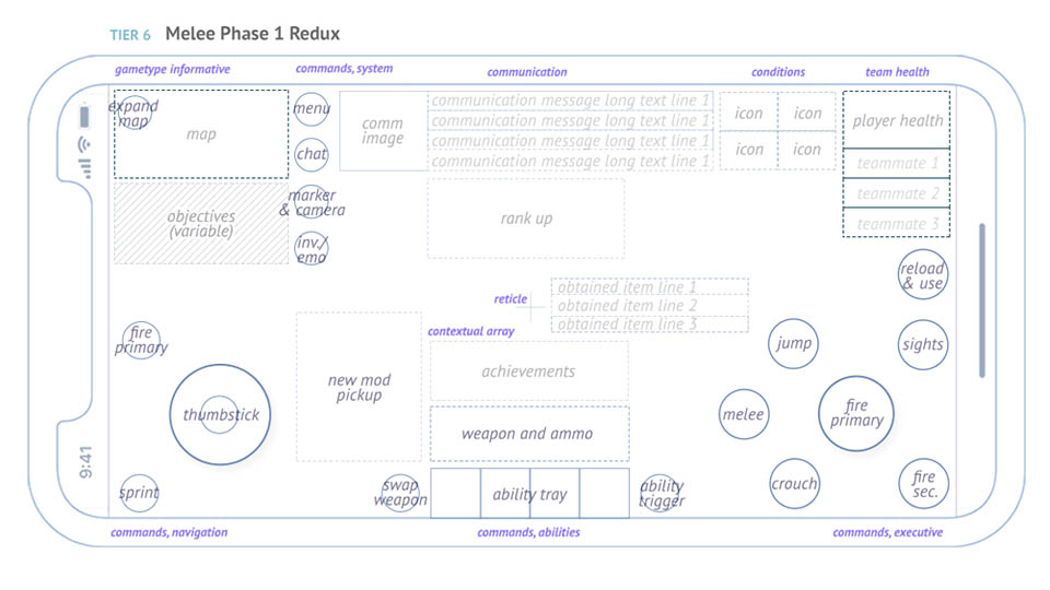
My wireframe for Warframe Mobile (Digital Extremes) an effort to bring years of console/pc gameplay to the phone
GENRE: ACTION GAMES
In the realm of action games, the UI needs to treat the screen as the stage and the explosive, bombastic gameplay as the Diva of the show. Your job is to support the Diva and her craft and dear God, never to overshadow her. Crafting a UI for action games necessitates a delicate balance — it should be unobtrusive, seamlessly blending into the gaming environment, while also delivering swift access to vital information: health, mana/energy/stamina, ammo, moodles, etc. There are also unique considerations like HUD transparency/opacity, color schemes, icon complexity… the rabbit hole ever descends in videogame UI/UX.
As the game UI artist delves into the wireframing process, a primary focus lies on ensuring that the HUD is discreet yet highly functional – and a large part of our job is to showcase just how functional through static imagery first. That’s the wireframe: a still-life image of a future video game in action! Obviously, this involves a meticulous consideration of the placement of key elements to avoid obstructing the player’s view or causing unnecessary distraction during intense gameplay… But it could also mean knowing how to distract them in just the right way at just the right time (pings, flashes, etc.).
The minimalistic design philosophy extends beyond mere aesthetics; it is a strategic choice aimed at enhancing the player’s focus on the core action unfolding on-screen. But there is no one-size-fits all solution for this genre; and some titles want a very “gamey” feel (Doom Eternal, Lies of P, Elden Ring) while others want as much of an organic experience as possible (Last of Us, Deadspace, Metroid Prime). You’ll need to be far more sensitive to your project than you are to the audience. The audience don’t know diddly doo. The genre will speak to you. Oh, and if you’re looking for help on your HUD, check out this quick blog I made!
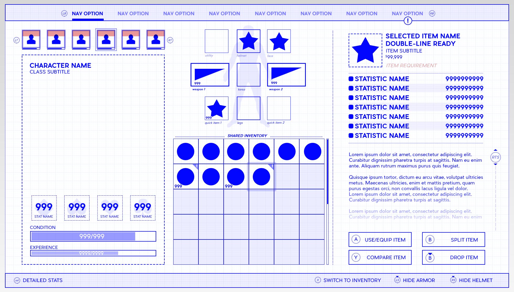
my wireframe on Wasteland III (InXile, Microsoft), another difficult project bring pen & paper RPG detail to consoles
GENRE: RPGs & STRATEGY GAME
In the expansive realm of role-playing and strategy games, where intricate systems and detailed inventories are commonplace, the role of the user interface becomes paramount and exponentially more complicated. During the wireframing stage for these genres, a key emphasis is placed on achieving clarity and establishing a logical hierarchy within the UX first, then draping artwork on top of that. Start with the vitals, work your way up from that. In 4X Strategy games, there really is no end to the complexity you could frontload… so you know… maybe don’t!
The goal for RPGs and Strategy games is to create an interface that seamlessly guides players through the complexity of character statistics, inventories, skill trees and the like. Unlike the unobtrusive nature of UI in action games, the UI design for RPGs and strategy games serves as a crucial tool for players to navigate the expansive landscapes of character development and strategic decision-making. So that means new ways of thinking of traditional ideas like “annoying” and “subtle”.
Beyond the functional aspects, the design philosophy extends to the narrative dimension of RPGs and strategy games. The UI is crafted not just as a utilitarian feature but as a storytelling device. Perhaps HUD elements react to narrative beats like being poisoned, corrupted or hallucinating. An alien weapon has glyphs for a readout instead of numbers. Striking the right balance between informative clarity and narrative subtlety, the UI in RPGs and strategy games becomes an integral part of the player’s journey, facilitating engagement with the game’s rich tapestry of characters, quests, and strategic challenges. Or as I like to call it: sexy math. And hey, speaking of which, if you want to read my own post-mortem on my Inventory Screen for the RPG Wasteland 3, check this out!
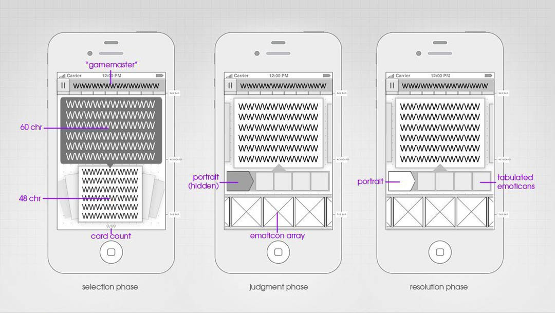
My wireframes on an ultra-casual game “Inappropriate!” for Red Hot Labs (a studio later bought by Google)
GENRE: PUZZLE & CASUAL GAME
For puzzle and casual games, the mantra is simplicity… which is way more complicated that it seems! During the wireframing stage for these genres, the UI/UX design is centered around creating an intuitive and visually appealing experience, most of the time erring on the side of in-context fun rather than immediacy or efficient information design. Essentially, everyone gets to loosen their ties on this one.
Clarity is paramount, ensuring that players can effortlessly interact with the game without being bogged down by unnecessary complexities. Consider your average match-3 game. What possible distractions or extraneous detail could you possibly add that isn’t supporting the main playfield? That particular genre almost funnels you into clever design decisions. Conversely, an abstract Escape Room style puzzler in VR would almost certainly have intuitive 1-to-1 control, where who even knows what counts as right or wrong. It’s a blank check.
Given the prevalence of mobile platforms for puzzle and casual games, the wireframing strategy often places a strong emphasis on touch-friendly elements. This mobile-forward thinking both frees the screen from button prompts, but hamstrings it in other, more profound ways. For example, when you hold a mobile device, you naturally cover a third of the screen! No other platform has that insane limitation, or the bizarre marching order that some games must be forced into portrait or landscape mode.
Ultimately, the wireframing process for puzzle and casual games seeks to achieve a harmonious union of simplicity, visual appeal, and user-friendly functionality. But that “harmony” largely favors simplicity. Oh, and if you want one of my earliest blogs, I did a deep dive into things you should avoid in your VR game’s UI design here!
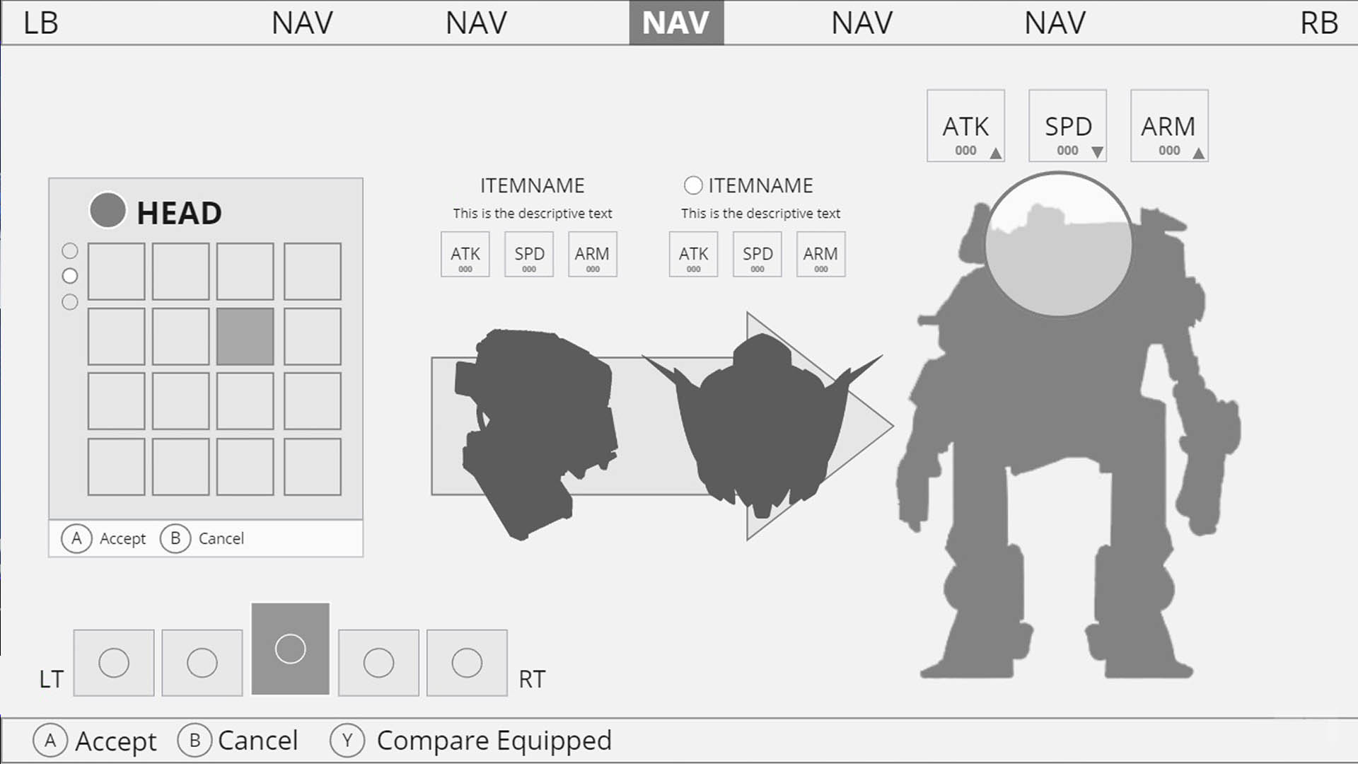
Student Work from my Game UI Design Mentorship Program, by Kyle C.
GENRE: ROYALE AND MMOs GAMES
For Royale and massively multiplayer online (MMO) games, effective communication and coordination among players are paramount, and one of the more defining challenge of this genre. Obviously, these games share the same complexities as an RPG and Action game combined, but now with the added layer of a kind of “meta community”. During the wireframing stage for these genres, the primary emphasis is crafting a UX Design that enhances social interaction and team-based gameplay. Simple ideas like a text chat can balloon into complex knots on mobile (how many lines? How wide? Where?). Innovations like in-character voiced commands are unique solutions to these kinds of unique problems.
Team-based interfaces have nuanced considerations in the wireframing process. For example: in Royale games it is quite common to have a mini map and a compass. The compass in this instance serving more as a tool for teams to coordinate, same as the grid markers on the enlarged map. But then there are quality of life improvements that can shake up a whole industry – like tagging anything you see; enemies, items, objectives, etc. Through traditional or inspired means, the UI in Royale and MMO games should facilitate a seamless flow of information and interaction, empowering players to work cohesively towards shared objectives.
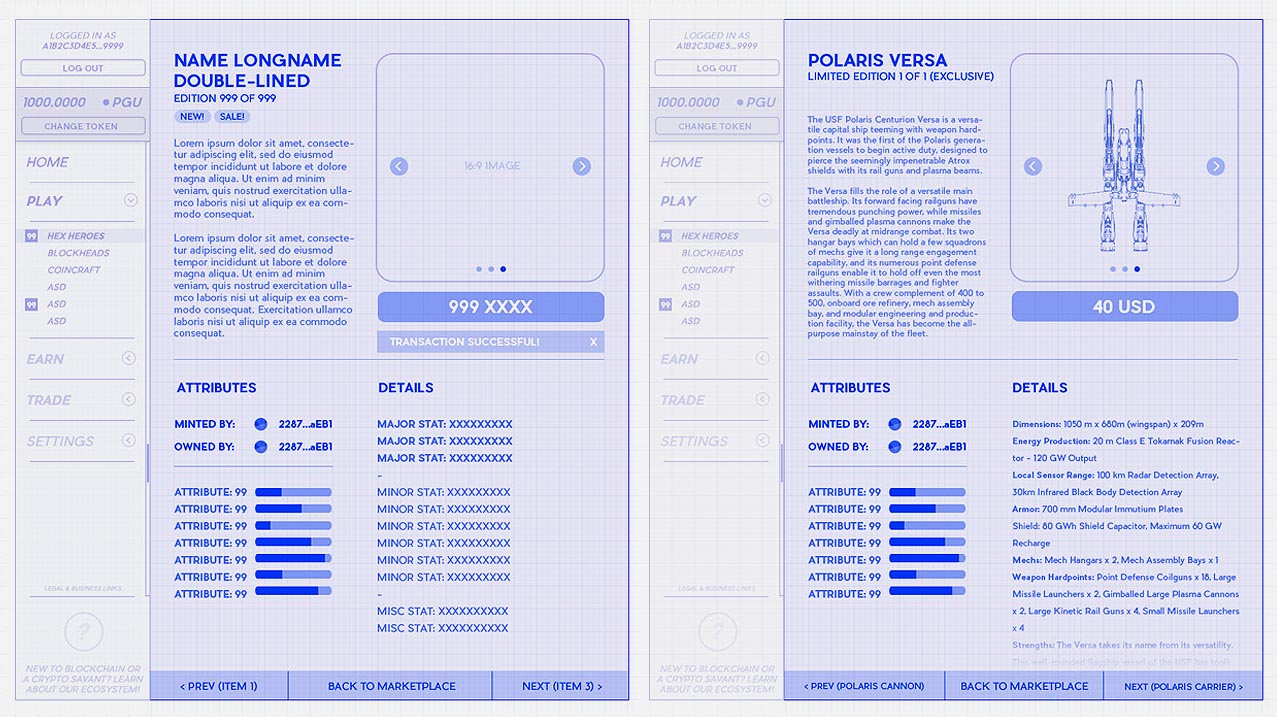
My wireframe work for a Web3 game (Unnamed) by Polyient Games
GENRE: SIMULATIONS & SANDBOX GAMES
While not the easiest to define, especially in Indie circles, simulations and sandbox games demand constant bespoke solutions, meaning the UI/UX Design of this genre in particular is a crucial aspect of the player’s experience. During the wireframing stage for these genres, the primary focus is on creating intuitive interfaces that empower the Player… though in this genre it’s better to call them Users. These kinds of genres almost always eschew pretty UI for dogmatically practical UX. That tends to mean endless reams of tables, panels, data… boring stuff that tends to be done in very boring ways!
Wireframing for simulations involves careful consideration of the game’s intricate systems and wrapping them in a cocoon – hoping something pretty might one day emerge. If that sounds cynical, well… I’ve played my fair share of hardcore Racing and Flight simulators and whoo boy, do they play fast and loose with good design. The greatest challenge is the sheer amount of information in these games, some of it pure data, some of it graphical, and arranging it so it’s not just intuitive… but swiftly flowing for a User who’s now in their 50th hour in the game.
For Sandbox games, crafting elaborate-yet-clean interfaces and world-building tools are central components. Access to your hotkey tools, knowing how many components you need for crafting, rarely having to switch to other menus to accomplish menial tasks… the list goes on and becomes more bespoke the farther you go. Prioritizing flexibility is key; Sandbox UI should adapt to the diverse preferences and playstyles of players, offering a range of customization options that enhance the overall gaming experience. Regardless of unique genres, if you’re interested in game UI design (and you made it this far!), check out this Blog I wrote on 10 easy ways to practice game UI design on your own!
CONCLUSION
Genres are a easy way for consumers to kinda-sorta guess at what style of endorphin rush they’ll be receiving for their money. But in term of actually making that game, genres may not be quite as useful! Game UI wireframing is a nuanced process that evolves with the diversity of gaming genres. By tailoring your approach to the specific demands of each genre, you can create user interfaces that enhance the overall gaming experience. Whether it’s the adrenaline of an action game or the strategic depth of an RPG, a well-crafted UI wireframe is the bridge between players and the virtual worlds they explore. As you embark on your game UI design journey, remember that adaptability and creativity are your greatest assets.
